I know you’ve all heard about the calamity which is about to descend upon the human race. The visions of death and destruction are downright Biblical. The seas will rise, the plants will die, the four horsemen of the apocalypse will reap a mighty harvest of flesh and bones. It’s the coming of man-made global warming!
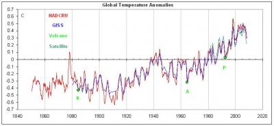
I know that you’ve all seen the temperature graphs showing the steady rise of global temperatures over the last 100 years. If you haven’t, allow me to introduce you to the infamous roller coaster of potential devastation, the rise in global temperature! [1]
 [2]
[2]
(Fig. 1)
The graph shows a rise in average global temperature over the last 100-150 years. The scale of the graph is -.7 degree Celsius up to .7 degree Celsius. It’s a regular toaster oven here on ye olde Terra!
Now, this is a graph that has been used to hype a religion based on junk science, and there is a serious flaw we all need to understand. The Mainstream Media won’t discuss it, the politicians are too stupid to know anything about it, and the communists the world over ignore it in their haste to destroy progress.
Here’s the dirty little secret: The Earth is 4 billion years old.
In geologic time scales, 100 years isn’t even the bat of an eyelash. It’s certainly not a long enough period of time for us to have gathered enough data to yield statistically significant values for historical averages or the historical standard deviation of temperatures.
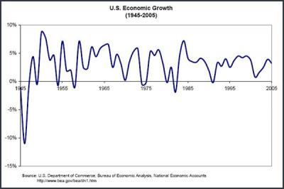
Let’s examine this with the promised illustrations. I’ve picked an illustration which, unlike the HAD CRU’s version of climate change, has easily accessible, original data.
This is the graph of the US’s economic growth from 1945 to 2005 (source [3]):
 [4]
[4]
(Fig.2)
This graph shows 60 years worth of economic growth in the US. See all the peaks and valleys? The rises and the falls? The line of best fit (average) is somewhere between 3% and 3.5% growth per year.
Now, imagine that Fig. 2 is the graph for the average global temperature, across all 4 billion years that the Earth has been spinning around the sun.
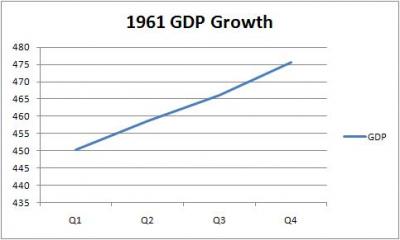
But this isn’t the graph the man-made global warming communists are showing you. Their graph looks something like this:
 [5]
[5]
(Fig. 3 Data source [6])
Based on the graph of 1961’s GDP growth, if that was all you knew about the US economy, it would look as though the US had roughly 105% growth, on average. Not even close to the truth, is it?
But that’s not even right because they’re only showing you the 100 years worth of data, out of 4 BILLION years worth of climate.
That’s .000000025% of the total graph of global temperatures.
In reality, giving you the year of 1961 as all of the economic data for the US economic growth over that 60 year period gives too much information compared to the hoax that is man-made global warming.
Over 60 years, we have 21,900 days. In each day, there are 1,440 minutes. Thus, in 60 years we have 31,536,000.00 minutes, which would represent .0000000315% of the total time.
In other words, 1 minute’s worth of economic data would be more information about the US economic growth over that 60-year period than the 100 years worth of climate data gives us about the Earth’s historical global temperature.
Over that 60-year period of economic activity, for this illustration to hold, we would have to look at roughly 3/4 of a single second’s worth of economic data to approach what the man-made global warming crowd is urging you to get upset about.
That would be similar to seeing the stock market ticker now, and 3/4 of a second later, seeing it go up less than a single point, and then advocating the complete destruction of the world’s economic system.
Wake the **** up, people!
The best scientists can determine, the Earth’s temperature in the Cretaceous Period was anywhere from 5 [7] degree C to 8 [8] degrees C warmer than it is today. During the last Ice Age, the best guess is that the global temperature was about 5 [9] degrees C cooler than it is today. Thus, a graph of global temperatures that tries to reflect reality would show a range on the Y axis of at least 5 degrees C down to -5 degrees C.
We have a graph that goes from .7 down to -.7, or 14% of the total variation in temperature we believe the Earth has seen.
And that graph is based on manipulated data, as everyone who doesn’t live under a rock and has heard about Climategate, knows.
Junk science and fear mongering, all the way around. Al Gore is like the liberal version of Hal Lindsey. [10]
- Author Bio [11]
- Latest Posts [12]
Mike McGowan [13]
Latest posts by Mike McGowan (Posts [14])
- From one single father to the next [15] - July 20, 2012
- Why isn’t anyone talking about the man [16] - February 13, 2012
- Questions about the power of precedent [17] - February 8, 2012
- Suffer not the Innocent to find relief [18] - February 2, 2012
- Romney v. Newt: How the GOP and the conservative media killed the TEA Party [19] - January 31, 2012